
Have you ever wondered why certain types of conflict seem to cluster in specific regions — or why some areas remain peaceful?
Traditional analysis might count how many incidents occur. Spatial analysis lets us see how those incidents are arranged — are they clustered around borders, along roads, or near population centers?
For example, in a conflict zone, we might find that attacks cluster along major highways or near disputed boundaries. This pattern tells us something about accessibility, control, or strategic importance — insights that are invisible in non-spatial data.
Here is where spatial analysis plays a huge role.
What Is Spatial Analysis?
Spatial analysis goes far beyond plotting points on a map. It’s about using spatial data to see, measure, and explain patterns that aren’t obvious at first glance. But before we analyze anything, we start by asking spatial questions; questions that focus on where things are, why they are there, and how they relate to other things in space.
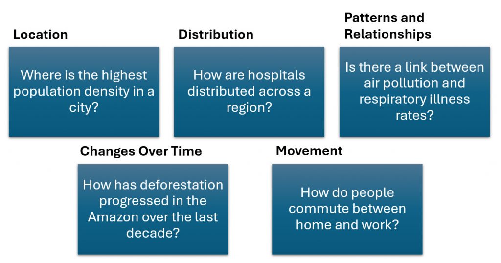
Spatial questions are powerful because they shift our focus from just counting things to understanding relationships in space and time. Once we start asking spatial questions, we can use GIS tools to uncover hidden patterns and connections that reveal how geography shapes human behavior.
The Foundation of Spatial Thinking
Waldo Tobler’s First Law of Geography “Everything is related to everything else, but near things are more related than distant things”, is a cornerstone of spatial analysis and geographic thought. Proposed in 1970, this deceptively simple statement captures a fundamental truth about spatial patterns and relationships. It reminds us that proximity matters: phenomena that occur close to one another are likely to share characteristics, influence each other, or exhibit similar behaviors. Whether analyzing population density, climate patterns, or social networks, Tobler’s law provides the conceptual foundation for understanding spatial autocorrelation, the idea that location-based data points are not independent but often exhibit systematic spatial relationships.
Why Tobler’s Law Still Matters
In modern spatial analysis, Tobler’s First Law underpins many of the tools and techniques used in geographic information systems (GIS), spatial statistics, and machine learning models that incorporate spatial data. From predicting the spread of infectious diseases to modeling real estate values, the law helps analysts account for the spatial dependencies that shape real-world phenomena. Yet, Tobler’s insight also serves as a caution: ignoring spatial relationships can lead to misleading results, known as the “spatial fallacy.” In essence, Tobler’s Law is not just a rule of thumb, it’s a reminder that geography is inherently relational, and that space itself is an active force in shaping the patterns we observe.
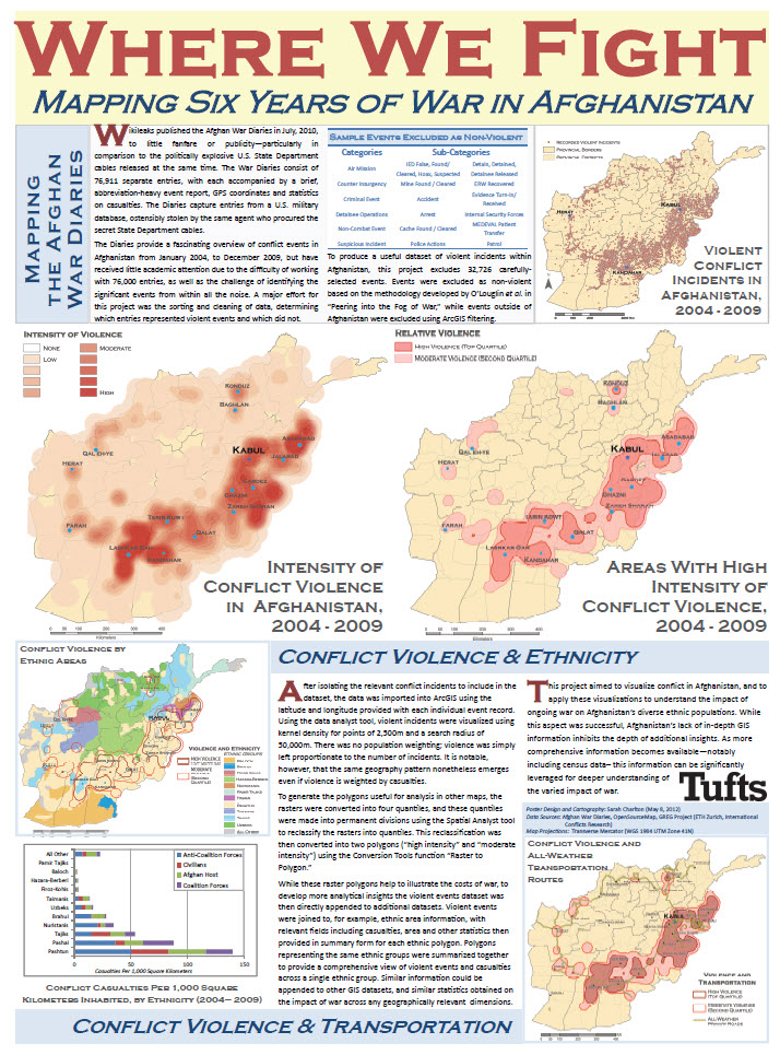
Afghanistan provides a striking example of Tobler’s First Law of Geography in the context of conflict. Throughout the two-decade war, violence rarely occurred in isolation, insurgent activity, military operations, and civilian displacement tended to cluster geographically. When instability intensified in one province, neighboring districts often experienced an uptick in attacks, road closures, or population movements shortly thereafter. This spatial spillover reflected both the physical connectivity of the landscape—shared mountain passes, trade routes, and ethnic ties across provincial borders—and the diffusion of influence through social and logistical networks. For instance, the spread of Taliban control from southern provinces such as Helmand and Kandahar toward central regions followed recognizable spatial gradients, with adjacent areas being more immediately affected than distant ones.
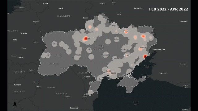
Look at the following example, which provides a visual idea of what I am trying to explain:
Understanding Point Pattern Analysis (PPA)
Point Pattern Analysis (PPA) is a core method in spatial analysis used to study the distribution of individual events or features—such as conflict incidents, disease outbreaks, or infrastructure locations—across geographic space. Each event is represented as a point on a map, and analysts use statistical and visual techniques to determine whether the pattern of those points is clustered, dispersed, or random. PPA helps reveal underlying spatial processes: are events influencing each other’s locations, responding to shared environmental or social factors, or occurring independently? By understanding these patterns, researchers can move beyond simple mapping to explain why spatial distributions occur as they do.
- Clustered: Points are grouped closely together in specific areas, suggesting localized processes or interactions. In conflict analysis, clustered patterns might appear as repeated border skirmishes along contested boundaries or a concentration of attacks around key urban centers. Clustered patterns often indicate spatial dependence—nearby events are influencing each other or responding to shared conditions.
- Dispersed: Points are evenly spaced across an area, implying some form of territorial control or deliberate spacing. For example, military outposts may be distributed in a dispersed pattern to ensure maximum coverage and surveillance efficiency. Dispersed patterns often suggest competition for space or strategic planning that minimizes overlap.
- Random: Points appear scattered without any discernible structure or pattern. While random distributions are useful as a theoretical baseline for comparison, they are relatively rare in real-world data. Most spatial phenomena—especially human-driven ones like conflict—exhibit some degree of clustering or dispersion due to environmental, political, or social factors.
At its core, PPA is about uncovering structure within what might initially appear as noise. For instance, when analyzing incidents of violence in a conflict zone, PPA can help identify whether attacks tend to concentrate near borders, population centers, or along transportation corridors—providing vital insights into tactical or strategic behaviors.
Tools for Point Pattern Analysis in ArcGIS Pro
ArcGIS Pro provides a suite of geostatistical and spatial statistics tools designed specifically for Point Pattern Analysis (PPA). These tools help identify whether a set of points—such as conflict incidents, crime locations, or disease cases—is clustered, dispersed, or randomly distributed, and at what spatial scales those patterns occur. Below are some of the key tools commonly used in PPA workflows:
Below are five key tools you can use, starting from the simplest to the more advanced:
Average Nearest Neighbor
The Average Nearest Neighbor (ANN) tool is one of the simplest and most useful starting points. It measures the average distance between each point and its nearest neighbor to determine whether the pattern is clustered, random, or evenly spaced (dispersed). The tool’s output is a straightforward report that includes a ratio and a p-value indicating whether the observed pattern is statistically significant. For example, you could use ANN to see if incidents of violence or protests are concentrated along a border or spread evenly across a region.
Kernel Density Estimation (KDE)
The Kernel Density Estimation (KDE), creates a smooth, continuous surface showing where points are concentrated. The result looks like a heatmap, where warmer colors indicate higher densities. KDE is especially helpful for visualizing hotspots—areas where many events occur close together. For instance, it can reveal regions with the highest number of border skirmishes, traffic accidents, or disease cases, helping you see patterns at a glance.
Hotspot
Once you’ve identified possible clusters visually, you can use Hot Spot Analysis (Getis-Ord Gi*) to determine whether those clusters are statistically significant. This tool identifies areas with unusually high or low values compared to their surroundings, labeling them as “hot” or “cold” spots. In a conflict analysis example, hot spots might represent zones where violent incidents consistently occur more frequently than elsewhere, while cold spots show areas of relative calm.
Spatial Autocorrelation (Moran’s I)
The Spatial Autocorrelation (Moran’s I) tool takes the analysis a step further by examining whether similar values occur near each other in space. It’s particularly useful when each point has an associated attribute, such as casualty numbers or event severity. A strong positive Moran’s I value means that similar values—such as high-intensity conflict events—tend to be located near one another, while a negative value indicates that dissimilar values are clustered together.
Multi-Distance Spatial Cluster Analysis (Ripley’s K Function)
Finally, the Multi-Distance Spatial Cluster Analysis (Ripley’s K Function) explores clustering or dispersion across multiple distance scales rather than just one. This more advanced tool helps identify complex spatial processes that might operate at both local and regional levels. For example, it can show that small-scale clustering occurs within districts, while broader clustering exists across an entire province or border region.
It is important to note that this tool differs from the Average Nearest Neighbor (ANN) and Ripley’s K Function both measure how points are arranged in space, but they differ in scale and detail. ANN looks at the average distance from each point to its closest neighbor, giving a single summary of whether the pattern is clustered, random, or dispersed overall. It only considers one scale — the nearest neighbor distance. In contrast, Ripley’s K Function examines many distances, showing how clustering or dispersion changes across different spatial scales. This means ANN tells you if clustering exists in general, while Ripley’s K reveals at what distances clustering or dispersion happens.
A good application of Ripley’s K is in ecology. For example, studying whether trees in a forest grow in clusters or evenly spaced at different distances. Another example is in epidemiology, if you want to see how disease cases spread across an area and at what scale the clustering occurs.
Important note: In order to perform any of these analysis, it is important to make sure the data is projected, that is, that it has a PCS rather than a GCS.
Putting It Together: From Patterns to Insights
Identifying spatial patterns is only the first step in geographic analysis—the real value lies in interpreting what those patterns mean. Once you’ve used tools like Average Nearest Neighbor, Kernel Density, or Hot Spot Analysis to reveal whether your data is clustered, dispersed, or random, the next challenge is to connect those spatial patterns to the social, environmental, or political processes that shape them. This is where geography moves beyond mapping and becomes analytical—helping us ask why certain patterns occur and what they tell us about the world.
For example, a clustered pattern of conflict events along a border might suggest territorial disputes, ethnic tensions, or resource competition driving localized instability. A dispersed pattern of military outposts, on the other hand, could reflect deliberate spatial planning for surveillance or control. Even when points appear random, that apparent randomness can offer insight—perhaps indicating a lack of centralized control, or data limitations that obscure the underlying structure. Recognizing these patterns gives analysts a foundation for building hypotheses and guiding further investigation.
Moving from patterns to insights often involves integrating contextual data—such as population density, infrastructure networks, or terrain features—to explore the relationships between events and their environment. Spatial joins, overlays, and regression models in ArcGIS Pro can help test these relationships statistically. For instance, analysts might compare conflict hotspots with road networks to see whether accessibility influences where violence occurs. By layering datasets and using spatial statistics, GIS users can move from simply mapping where things happen to understanding why they happen there.
A practical illustration of this process can be seen in analyses of conflict dynamics in Myanmar. When researchers mapped armed clashes and attacks across the country, they observed distinct clusters in the western and northern border regions—particularly in Rakhine, Kachin, and Shan States. By overlaying these point patterns with ethnic composition, road networks, and terrain data, analysts found that conflict intensity often correlated with areas of difficult terrain and ethnic diversity. Mountainous regions provided cover and logistical advantages for insurgent groups, while border proximity facilitated movement and resource access. These spatial relationships helped explain not just where conflict occurred, but why certain areas remained persistent hotspots. Through this integration of spatial data and contextual understanding, GIS transforms scattered points of violence into a coherent picture of how geography, politics, and human behavior interact across Myanmar’s landscape.
Ultimately, these insights bring us back to Tobler’s First Law of Geography: “Everything is related to everything else, but near things are more related than distant things.” Spatial analysis helps make those relationships visible. The tools we use in GIS—whether identifying clusters, measuring density, or testing spatial relationships—are not just technical exercises; they are ways of uncovering how place, proximity, and context shape real-world outcomes. When we interpret patterns thoughtfully and connect them to social and environmental processes, maps become more than visualizations—they become evidence for understanding how the world works.
Finally, I’ll share examples of work produced by students at the Fletcher School who have applied one or more of these spatial analysis tools in their own research. These projects show how methods and related techniques can be used to move from raw geographic data to meaningful analytical insights in practice.
- The Road to Conflict by Matthew Davis.
- We have been boarded by Christopher Marks.
- From Escalation to Exodus by Julia Huber.
- Krill in the Antarctic Peninsula by Natalia Perez.
- Potential for Peace by Megan (Meg) Smith.
- Rocking the World or Kicking Rocks? by Katherine Walsh.
- Russian Guns & Gold in the Sahel by Brett Saxe.
- Who Wants the Money? by Ryland Pitts.
- Frontlines in Motion by Nathaniel Oakes.
- From Conflict to State Collapse and Displacement in Syria by George Apostolou.