

Best Practices to Import Data for GIS
Working with GIS often starts with good data—and for many of us, that means working with Excel tables. Before importing your spreadsheets into ArcGIS Pro, it’s important to clean and format them properly. A little preparation upfront can save you a lot of time (and errors) later on.
To make this easier, I’ve created a series of short tutorial videos that walk you through some of the most useful tips and tricks for cleaning Excel files before bringing them into ArcGIS Pro. But first, let me walk you through a couple of points on why it is important.
Why Cleaning Excel Data Matters
ArcGIS Pro is picky about how it reads tables. If your spreadsheet has merged cells, blank rows, or inconsistent field names, your import won’t go smoothly. By learning how to prepare your data, you’ll ensure that:
- Your joins between Excel and spatial data work correctly.
- Fields are stored in the right format (text vs. numeric).
- Errors and mismatches are minimized.
To ensure a smooth import process and accurate data analysis, here are some simple guidelines for formatting your tables:
- First row as field names: The very first row of your table should contain the field names, also known as attributes. These are the labels that describe the type of data in each column, such as “City,” “Population,” or “Area.”
- Consistent data rows: The rows following the first row should contain the actual data. Each row represents a different record (or feature), and each cell should correspond to the appropriate field name in the first row.
- Keep the table simple: Avoid using complex or nested structures in your tables. GIS software prefers straightforward, clean data where each field is clearly defined and every row is consistently formatted.
The logic behind the format of a table in GIS is straightforward: each row in your table represents a different record, also known as a feature in GIS. Think of a record as an individual data entry or item, such as a specific city, a particular landmark, or a single measurement point. Each feature (or record) has its own unique set of information that describes it.
To keep this information organized, each cell in a row corresponds to a field name specified in the first row of the table. The first row acts as a header, defining the type of information stored in each column. For example:
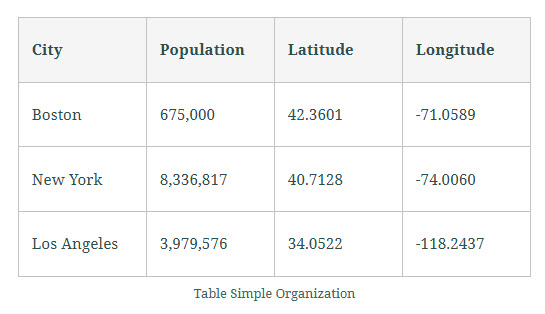
In this table:
The first row contains the field names: “City,” “Population,” “Latitude,” and “Longitude.” Each subsequent row represents a different city, with each cell providing specific data for that city under the relevant field name.
By organizing your table in this way, you ensure that the GIS software can accurately interpret and use the data for mapping and analysis.
What You’ll Learn in the Videos
Each video uses an example table sourced from either a federal agency or an organization that provides open data. All the data I use is publicly available and typically comes with metadata. While I won’t go into much detail about the metadata in these videos, the tutorials may cover one or more of the following topics:
- Renaming worksheets
- Deleting extra rows
- Fixing merged cells
- Cleaning field names
- Splitting fields
- Checking field types
- Creating pivot tables
- And more…
If you’re ready to make your Excel data GIS-ready, check out the videos here:
Simple Formatting
The two images below shows two tables side by side. On the left is the original Excel table, and on the right is the version formatted for GIS import. Both tables contain the same data, but in the GIS version, the field names have been modified, and the formatting with arrows has been removed. Take some time to explore the differences.
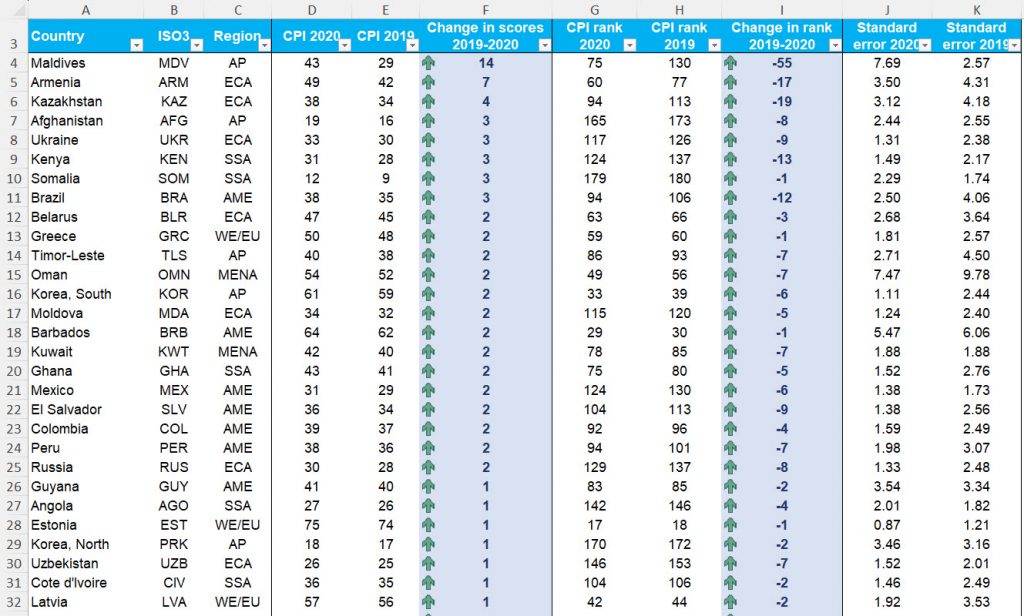
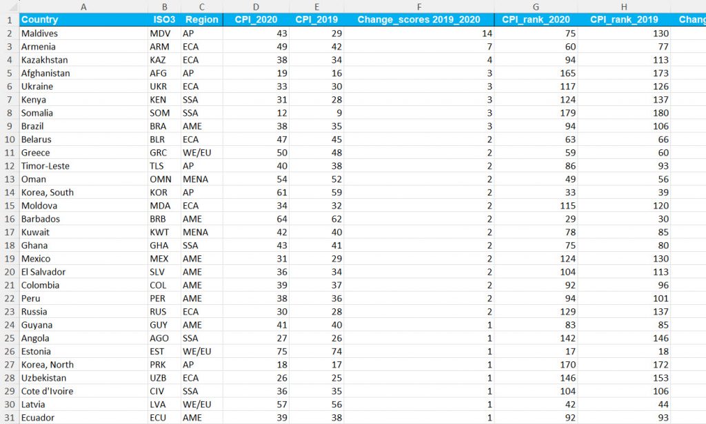
The data for this exercise comes from Transparency International . You can download the data from their website in the section titled ‘ FULL 2020 MATERIALS ‘ after selecting the appropriate year.

In order to do this, follow the instructions below:
- Ensure the table has no logos or headers. If so, remove them.
- Verify that the first row contains the field names.
- Plan the necessary edits to clean the table and once you do that, copy the data into a new worksheet as ‘values’ only to remove existing formatting.
- Remove spaces and special characters from the field names. Ensure to keep the field names, short.
- Rename the worksheet for easy identification when importing into GIS.
- Create a metadata sheet listing the original field names and their corresponding final names for reference.
Please watch the following video that shows how this can be done.
Pivot Tables
Pivot tables in Excel are powerful tools for quickly summarizing and analyzing datasets. Instead of writing complex formulas, pivot tables can automatically sort, count, and aggregate your data, making it easier to spot patterns and draw meaningful insights.
When working with GIS, clean and well-structured data is essential. Pivot tables help you prepare your data by organizing and summarizing it effectively before importing it into GIS software. This step ensures your dataset is consistent and comprehensive, which leads to more accurate spatial analysis and better visualizations.
In short, pivot tables let you transform raw data into an interactive summary that highlights key trends and relationships. This streamlines your data preparation and improves the overall quality of your geospatial analysis—resulting in more reliable and actionable insights.
Below, you’ll find a video example showing how to create and use a pivot table.
Split a Column
Splitting columns in Excel is an important step to ensure data integrity, accuracy, and usability before importing into GIS software. When attributes are combined—for example, spatial unit codes with their names, or latitude with longitude—it can cause problems in analysis. By separating these values into distinct columns, you make your data easier to manage, join, and georeference within GIS. This not only improves data quality but also supports better customization, validation, and ultimately, more reliable insights in GIS applications.
For our first example, we’ll use a dataset downloaded from Statistics South Africa. Keep in mind that ArcGIS Pro works best with simple tables. It does not handle tables well if they contain extra elements such as images, colors, long headings, or additional text outside of plain columns and rows.
For this exercise, you won’t need to clean the dataset yourself—we’ll use a semi-cleaned table to focus on the process of splitting a column. In this dataset, one column contains both the code and the name of spatial units combined. To make the table suitable for GIS, we’ll separate these into two columns.
Below, you’ll find a video example showing the example.