
Learning the Modifiable Spatial Unit Problem (MAUP)
Have you ever noticed how the way we draw boundaries on a map can totally change the story the data tells? Think about it: if we look at average income by State, we might see big differences county by county… But if we zoom in and look at income by tract, the data will tell us something different! Same data, different story.
This is exactly what geographers and GIS folks call the Modifiable Spatial Unit Problem, or just MAUP (pronounced “mop” — kind of like the thing you clean your floor with). It’s a fancy name for a simple but powerful idea: the results of our analysis can change depending on the scale we choose (small areas vs. big areas) or how we draw the boundaries.
Why should you care? Because whether you’re mapping health outcomes, planning bus routes, or analyzing voting patterns, the way you chop up space affects the conclusions you reach. And if you’re not paying attention, you might end up with a misleading picture of reality or decisions will be made and someone will absorb the impact of those decisions.
Breaking Down the MAU
The Modifiable Area Unit Problem or MAUP, is a statistical bias that can occur during spatial analysis of aggregated data that causes differing results although the same analysis is applied to the same data. MAUP takes two forms: the scale effect and the zone effect.
At its core, the MAUP is a reminder that data doesn’t exist in a vacuum—it’s always tied to the boundaries we decide to use. The problem comes from the fact that these boundaries are modifiable: we can change them, and when we do, the results of our analysis can change too.
There are two main parts to this problem:
- The Scale Effect: This happens when you change the size of the spatial units you’re working with. For example, if you look at the income level tract level, you’ll see a lot of local variation. But if you zoom out to the county level, all that detail gets averaged out. The story you tell depends on the scale.
- The Zoning Effect: This happens when the boundaries themselves change, even if the scale stays the same. For example, you can imagine two different ways of dividing the same city into districts. Depending on how those lines are drawn, the average income, voting patterns, or crime rates in each district could look very different. A real-world parallel is gerrymandering, where political boundaries are deliberately drawn to influence election outcomes.
So, the MAUP is basically saying ‘your results can shift depending on how you carve up space.‘ That doesn’t mean the data is wrong—it just means you have to be careful about how you interpret it.
Why It Matters
Okay, so you might be thinking: “Cool idea, but does this really matter outside of a classroom?” The short answer is: absolutely.
The MAUP isn’t just some quirky detail that only geographers care about—it can actually shape decisions that affect real people. Here’s why:
- Research implications: If you’re analyzing data but don’t pay attention to scale or boundaries, you could draw conclusions that are misleading. What looks like a strong relationship at the neighborhood level might disappear at the county level.
- Policy and planning: City planners, public health officials, and even governments make decisions based on spatial data. If the boundaries they use mask important details, resources might get allocated in the wrong places.
- Fairness and representation: The zoning effect is a big deal in politics. Think about gerrymandering amd how districts are drawn can swing election results without a single vote changing.
- Everyday maps: Even the maps you see in the news or on social media can be influenced by MAUP. Two maps based on the same dataset can tell very different stories, just because of how the boundaries were chosen.
In short, how we divide space changes the story we tell. And if we’re not careful, the story could be incomplete—or even flat-out wrong.
How Can We Deal with the MAUP?
Now that we know the MAUP can mess with our results, the big question is: what can we do about it? The tricky part is that there’s no magic fix—you can’t completely get rid of the problem. But there are some smart strategies to keep it in check:
- Be aware of it! The first step is just recognizing that MAUP exists. If you know boundaries can change your results, you’ll be more cautious when interpreting them.
- Test different scales when possible. Instead of sticking to just one level (say, admin level 1), try running your analysis at multiple scales (like admin level 1, 2 and if possible, 3). If the results are consistent across scales, that’s a good sign. If they change a lot, that’s something worth reporting.
- Check different zoning models. Try using alternative boundary definitions or model representations. For example, compare administrative districts with grid-based divisions (aka, raster files). Seeing how sensitive your results are to zoning can give you a clearer picture.
- Use advanced methods. In more technical settings, researchers sometimes use things like multilevel modeling or spatial econometrics to account for scale and boundary issues. (Don’t worry—you don’t need to dive deep into this unless you’re doing heavy-duty research.)
- Be transparent. Always tell your audience what scale and zoning you used, and acknowledge that different choices might lead to different results. I always encourage my students to have more than one scenario! We might agree that transparency builds trust so recognizing it to your audience, will always be valuable.
At the end of the day, the goal isn’t to eliminate MAUP (because you can’t), but to make sure it doesn’t sneak up on you and lead you—or your readers—to the wrong conclusions.
Where Do We See MAUP in Action?
The MAUP isn’t just a class concept, it shows up all over the real world. Here are some examples where the way we draw boundaries really matters:
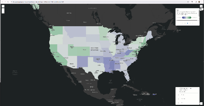
- Public Health: During disease outbreaks (think COVID-19), infection rates can look very different depending on whether you look at zip codes, counties, or states. Health officials need the right scale to spot hotspots and target resources effectively. Take a look at the maps published by the New York Times!
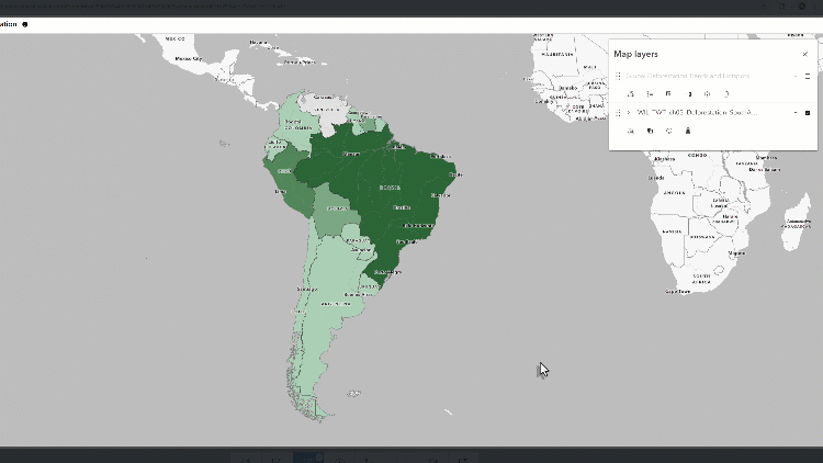
- Environmental Science: Patterns in land use, pollution, or biodiversity often shift depending on how you slice up the land. For instance, measuring deforestation by country might hide local “hotspots” of rapid forest loss. See example below:
- Politics: Gerrymandering is the ultimate example of the zoning effect. The way electoral districts are drawn can change who wins an election—even if the total number of votes doesn’t change.
- Social Science and Economics: Income inequality, unemployment rates, or crime patterns can tell very different stories at different scales. A city might look wealthy overall, but zoom in and you might find big pockets of poverty.
- Urban Planning: City planners use maps to decide where to put schools, parks, or public transport. If they only look at data by city districts, they might miss neighborhood-level differences—like one block that badly needs a bus line but gets overlooked because it’s “averaged out.”
Wrapping It Up
The Modifiable Spatial Unit Problem might sound technical, but at the end of the day, it’s really about one simple truth: the way we draw boundaries changes the story our data tells. Whether it’s the scale (big areas vs. small ones) or the zoning (how those areas are carved up), our choices matter and so do the consequences.
For anyone working with GIS or spatial data, being aware of the MAUP is essential. It keeps us honest, pushes us to question our results, and reminds us that maps aren’t neutral—they’re shaped by human decisions.
So, next time you’re looking at a map or running an analysis, ask yourself: What story would this data tell if I zoomed in, zoomed out, or drew the boundaries differently? That curiosity is the best tool you have against the MAUP.