
Cartography is the art and science of making maps, and in the context of geographic information systems (GIS) it is a critical step in turning data into information people can actually use. Maps are not just pictures of geography—they are carefully designed tools that help us navigate, see patterns, understand relationships, and share knowledge about the world around us.
A map’s effectiveness comes not only from the data behind it, but also from how its elements are designed and organized. Titles, legends, scale bars, symbols, and the map body all play a role in communication—but whether they succeed depends on applying solid cartographic principles.
In this post, we’ll first walk through six of the most important cartographic principles that every mapmaker (and GIS user) should consider when designing a map. We’ll then move into classification methods and symbology, which are essential for turning data into clear and meaningful visual stories.
Cartographic Principles
“The art and science of expressing graphically, usually through maps, the natural and social features of the earth” – Wade and Sommer, A to Z GIS, 2006
Good map design is not just about putting data on a page or screen. Cartographic principles guide how we make choices so that maps are clear, meaningful, and effective. These are the principles to consider:
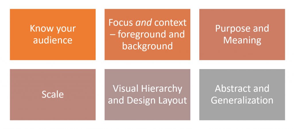
Know Your Audience and Purpose
One of the most important principles of map design is to know your audience. A map is never neutral—it is created for someone, with a specific purpose in mind. Before choosing symbols, colors, or a layout, cartographers must first think carefully about who will be reading the map and how they will use it. To start, every cartographer should ask themselves a series of guiding questions:
- Interpret the requirements of the user – What is the problem or need that the map should address?
- Who is the primary audience? – Are you making the map for experts, students, policymakers, or the general public?
- What medium will you use to present your map? – Will it be printed, displayed on a screen, or viewed interactively online?
- Where and how is the map most likely to be viewed? – Is it for a classroom, a mobile device, a report, or a large wall poster?
- Will your map be used to inform decisions? – For example, will it help emergency managers plan a response, or is it mainly for public awareness?
- What does your audience already know about your topic? – Should you assume basic geographic knowledge, or do you need to explain more background?
- What emotional tone do you want to set with your map? – Should it look formal and scientific, or approachable and engaging?
By asking these questions, mapmakers can make design choices that truly fit the needs of their audience. A successful map is not just accurate—it is also accessible, relevant, and meaningful to the people who use it.
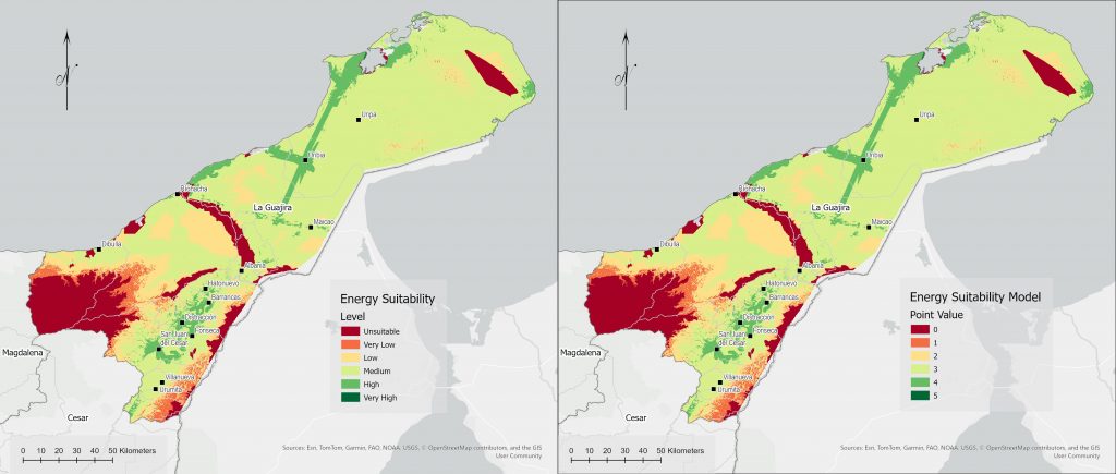
Imagine you’re making a map of a suitable area to implement a series of wind energy projects (see Figure 2). The version on the left uses symbology and labels that are clear for a general audience, while the version on the right is tailored for experts who already understand the technical details. Both maps show the same data, but they communicate differently because they are designed for different audiences.
Focus and Context – Foreground and Background
Every map has a story to tell, but not every part of the map is equally important to that story. Focus and context is about guiding the reader’s attention to the most important information (the focus), while still providing enough supporting detail (the context) to make sense of it. A useful question to ask at the start of design is: “What do I want my client—or the public—to think or notice when they look at my map?”
The answer to that question helps you decide what belongs in the foreground and what belongs in the background.
- Foreground: These are the features that should immediately catch the eye. They carry the central message of the map. For example, on a map showing flood risk zones, the highlighted flood areas would be in the foreground. They might be shown with bold colors or strong outlines to ensure they stand out.
- Background: These are the supporting elements that provide context but should not compete for attention. They help orient the viewer without distracting from the focus. In the flood map example, rivers, city boundaries, and roads might be in muted colors or lighter shades, so they remain visible but secondary.
Think of a map of bike routes in a city. The focus might be the bike lanes and trails. But without context—like showing major streets, parks, or public transport stops—cyclists might struggle to place themselves in the bigger picture. The context helps the focus make sense.
Balancing foreground and background ensures that maps are not overwhelming or confusing. The most important features should be immediately clear, while secondary elements quietly provide the setting in which the story makes sense.
Purpose and Meaning
Every map tells a story, but not every story is the same. Before you even start drawing, ask yourself: What is this map for? A map made for hikers has a different purpose than one made for a city planner. The purpose guides every choice you make—what to include, what to leave out, and how to present the information.
Meaning goes hand-in-hand with purpose. It’s about how your audience interprets the map. The same set of data can look very different depending on how it’s symbolized, colored, or labeled. For example, showing population density with bright red might communicate urgency or stress, while softer colors might feel more neutral. Meaning is shaped not only by the data but also by the design choices you make.
If your map has a clear purpose and conveys meaning that your audience can easily understand, it becomes more than just a picture of places—it becomes a tool for thinking, decision-making, or even storytelling.
Think about a university campus map. If it’s meant for new students on their first day, its purpose is to help them find classrooms and dorms quickly. That means the map should highlight walking paths, building names, and maybe even food spots. The meaning here is “this is how you get around without getting lost.”
But if the same campus map is designed for facilities staff, the purpose changes. They might need details like underground utilities, service roads, or maintenance zones. The meaning now is about managing and maintaining the campus, not just finding your way.
The places on the map are the same, but the purpose shifts the focus, and the meaning changes with the audience.
Scale
Scale is about how much of the world you show and how detailed it appears. A large-scale map (like 1:5,000) zooms in on a small area with lots of detail—perfect for showing individual buildings on campus. A small-scale map (like 1:5,000,000) zooms way out, covering huge regions but with fewer details—think of a world map in an atlas.
Choosing the right scale is about balance. Too zoomed in, and your reader might miss the bigger picture. Too zoomed out, and important details disappear. The trick is to match scale with the map’s purpose: a local bus route map works best at a large scale, while a map of global trade routes needs a small scale.
Think about maps you might use as a student. A floor plan of your dorm works at a very large scale—it shows where the laundry room, common area, and your room are, all in detail. But if you’re looking at a map of the whole city’s bus routes, that needs a much smaller scale—it shows neighborhoods and transit lines, not every individual bench or bike rack. Both maps are useful, but only when the scale fits the task.
Visual Hierarchy and Design Layout
When you look at a map, your eyes don’t absorb everything at once—they’re guided. Visual hierarchy is about controlling what the reader sees first, second, and last. By adjusting size, color, contrast, and placement, cartographers can ensure that the main message stands out, while supporting information provides context without distraction.
Design layout ties it all together: how the map, title, legend, scale bar, and other elements are arranged on the page. A clean, organized layout helps the reader find information quickly, while a cluttered one can be confusing. Consider the following:
- Too much detail can hide the theme of the map
- Too little detail can leave the map viewer lost
Think of it like making a presentation slide. You don’t want your key point buried in tiny text at the bottom. On a map, the same idea applies—the main message needs to pop.
A good map establishes a visual hierarchy that ensures the most important elements are at the top of this hierarchy and the least important are at the bottom. Typically, the top elements should consist of the main map body, the title (if this is a standalone map), and a legend (when appropriate).
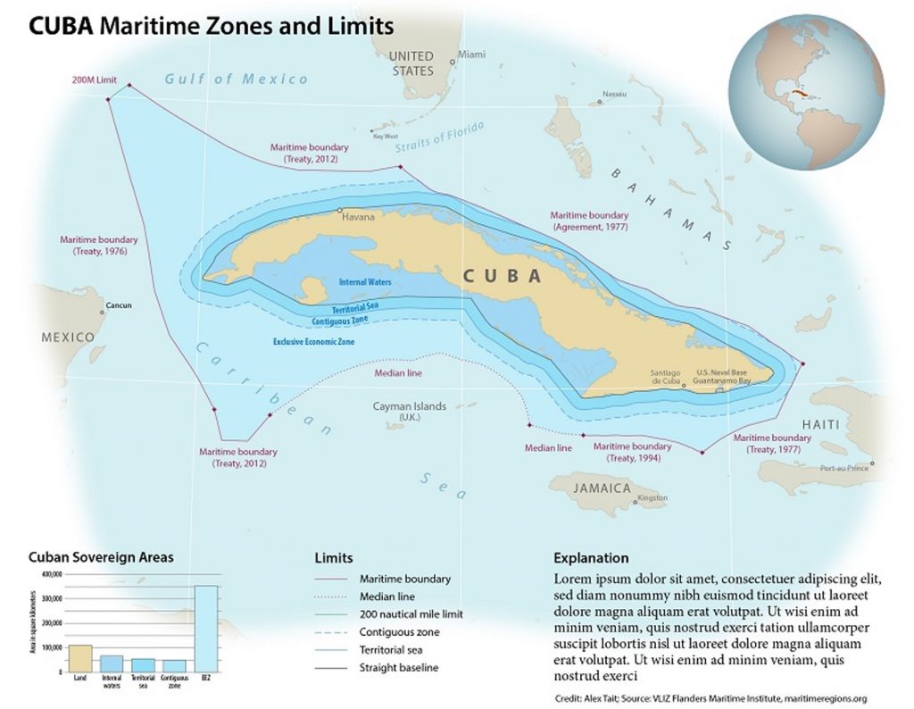
Take a map of Cuba’s maritime zones and limits (Figure 3). The highlighted boundaries of the zones take center stage—these are the elements the map is really about. Meanwhile, the background (such as the surrounding context) is shown in lighter tones. This creates a clear hierarchy: your eye first sees the maritime zones, then the supporting geographic context, and finally any additional details. The design layout reinforces this by giving prominence to the main map body and placing the title and legend where they can be quickly referenced without competing for attention.
Abstraction and Generalization
Maps aren’t mirrors of reality—they simplify the world. Abstraction is the process of turning messy, complex information into symbols and shapes. Generalization is about deciding what details to keep and what to leave out so the map is readable and useful.

Cartographers also need to simplify the features on a map beyond just choosing which types of features to display. This can involve deleting, smoothing, typifying, or aggregating entities. Without generalization, a map would be overwhelming.
Imagine trying to show every tree, bench, and lamp post on a city map—it would be impossible to read. Instead, cartographers pick the level of detail that fits the map’s purpose and scale.
Suppose you want to show the fishing zones of a community on a region’s map. If you tried to map every single fishing ground with full detail, the map would be cluttered and hard to understand. Instead, you could simply outline the boundaries of their overall fishing area. This way, viewers clearly see where the community fishes, without getting lost in unnecessary detail.
Classification and Symbology
Why Classification and Symbology Matter
When you look at a raw dataset in GIS, it’s just numbers and attributes — not very easy to interpret at a glance. Classification and symbology are what turn those numbers into a meaningful map. Classification groups values into categories or ranges so patterns become visible, while symbology gives those groups a visual language through colors, shapes, and sizes. Together, they help us answer questions like Where are the highest values? or How do different categories compare across space? Without careful classification and thoughtful symbology, a map can be confusing, misleading, or even hide the story the data is trying to tell.
Before diving into classification methods, it’s also important to understand the types of data in GIS, because they determine how we can symbolize and classify them:
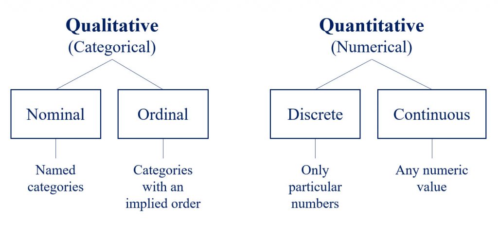
Recognizing whether your data is categorical or numerical — and whether it’s discrete or continuous — will guide you in choosing the right classification and the most effective symbology to communicate your map’s story.
Understanding the Distribution of Data
Before we jump into classification methods, it’s important to understand how numeric data is distributed. When we organize numbers, we usually order them from smallest to largest, sometimes grouping them into ranges, and then visualize them with graphs or charts. These visuals let us examine three key things: the shape of the data, its center (mean, median, mode), and its variability (how spread out the values are).
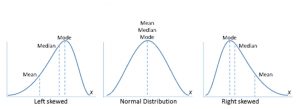
The most familiar shape is the normal distribution — the classic bell curve — where the mean, median, and mode all line up in the middle. But not all data looks this tidy. Sometimes the curve gets pulled or “skewed” to one side. In a right-skewed distribution, there’s a long tail stretching toward higher values (think city populations, where most towns are small but a few are very large). In a left-skewed distribution, the tail extends toward smaller values, pulling the curve in the opposite direction. Outliers — values that are much higher or lower than the rest — can also affect the shape dramatically.
So why does this matter for GIS? Because the way data is distributed directly affects how we classify it. Understanding the distribution is the first step toward choosing an appropriate classification scheme — and ultimately applying symbology that makes your map both accurate and easy to interpret. That’s exactly what we’ll explore next.
Classification Methods
Once you’ve looked at how your data is distributed, the next step is to decide how to group it into classes. Classification is about breaking your numeric values into ranges so that the map tells a clear story. Different methods produce different results, so the choice you make can highlight — or sometimes hide — patterns in your data.
Here are the most common classification methods you’ll encounter in GIS:
Natural Breaks (Jenks)
This method looks for “gaps” in the data distribution and creates classes at those points. It’s great for skewed data, because it tries to group similar values together and separate very different ones. For example, if most counties have incomes between 30k–50k, but a few are much higher, natural breaks will separate those higher ones into their own class.
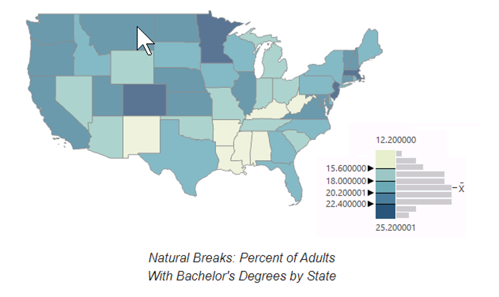
Natural breaks maps can be hard to interpret because the class boundaries can fall on odd numbers that have no intuitive rationale. However, in this case, the normal distribution results in a fairly even set of intervals that are not particularly confusing.
Because the distribution is normal and the breaks are fairly even, the map is visually balanced into five categories that do not seem to emphasize any one category or region.
Equal Interval
This method divides the range of values into equal-sized chunks. For example, if your data goes from 0 to 100 and you want 5 classes, each class covers 20 units (0–20, 21–40, and so on). Equal interval is simple and easy to understand, but if the data is skewed, most of your values might fall into just one or two classes.
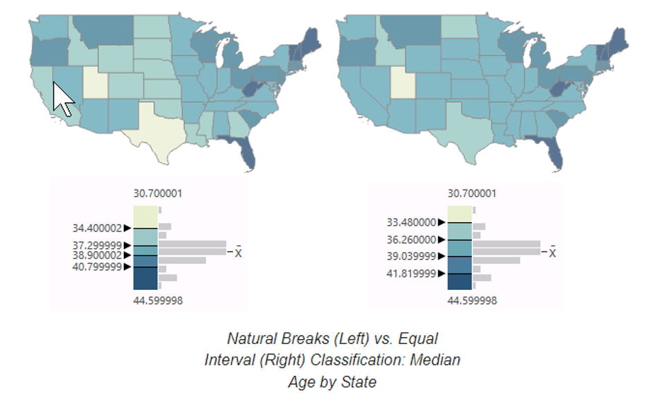
Equal intervals are the easiest to interpret since there is a clear numeric pattern to the category boundaries.
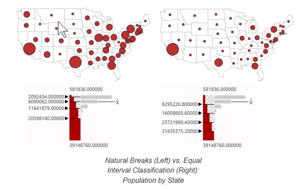
For a map of population (highly skewed log-normal distribution) the equal interval classification clearly focuses on how much more highly-populated the largest states are relative to the country, as opposed to the natural breaks classification which creates aggregations that blur those distinctions.
The equal interval classification with a normal distribution de-emphasizes the central cluster and brings out the extremes on the tails, as opposed to the natural breaks classification which brings out subtle variations in the middle that may not be meaningful.
Quantile
With quantile, each class has the same number of features, regardless of the actual values. For instance, if you’re mapping 100 counties and choose 5 classes, each class will contain 20 counties. This works well for showing relative rankings (like top 20%, bottom 20%), but the ranges may end up uneven, which can sometimes exaggerate differences.
Assuming the areas are of comparatively similar size, quantile classification distributes the colors of a choropleth evenly across the map and can blur clusters that occur in the data.
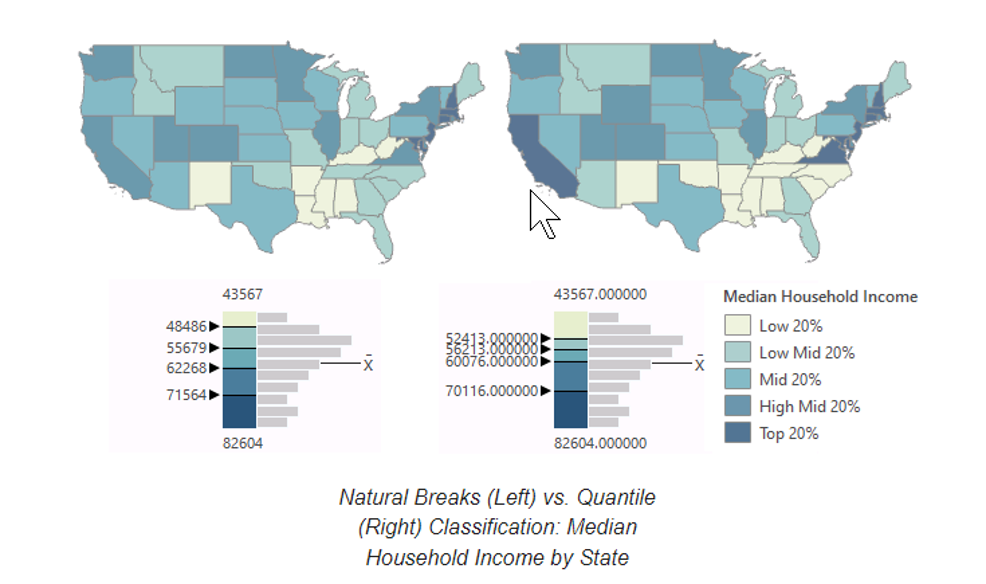
Because the values for the breaks between classes are determined algorithmically, they will likely have no inherent meaning or purpose. However, if you modify the legend to describe the breaks in percentiles, the categories will be much more understandable.
Compared to natural breaks, the quantile classification expands the numbers of states in the lowest and highest income and draws focus away from the states that are unusually poor or wealthy. Whether this is desirable is dependent on what you want the audience to take away from the map.
Standard Deviation
This approach measures how far values deviate from the mean (average). Classes are built around the mean in increments of standard deviation. It’s very useful for normally distributed data, because it highlights which areas are above or below average — helpful in fields like environmental monitoring or economics.
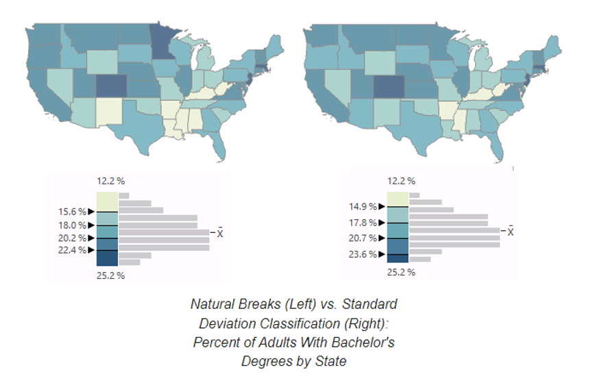
When creating maps for scientific audiences, this is a good choice when the data supports it. However, as with geometric classification, standard deviation classification will be mystifying to map viewers who do not have an understanding of basic statistics.
Standard deviation classification calls attention to outliers and values in the extreme tails. However, that can result in aesthetically bland maps since those values are rare in normally-distributed data.
Geometric Division
This scheme is most appropriate for data with a highly skewed log-normal distribution.
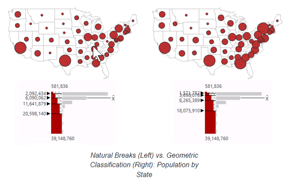
A logarithmic scale should be clear to experienced map readers with some statistical knowledge, but it can be mystifying to people who do not understand logarithms.
This scheme makes variations within the low-value cluster to be visible in a way that they would not in an equal interval classification. It also avoids natural breaks’ potential for creating class breaks on statistical anomalies. However, the logarithmic compression of values de-emphasizes wide variations.
Manual (or Custom) Breaks
Sometimes, you may want full control over your classes. For example, a health agency might define “low risk” as below 20%, “medium risk” as 20–50%, and “high risk” as over 50%. Manual classification lets you apply those thresholds consistently, regardless of the distribution.
Choosing the Right Method
The “best” classification method depends on your data distribution and your map’s purpose. If you want equal ranges, go with equal interval. If you care about ranking, try quantile. If your data is skewed, natural breaks may be best. And if you’re analyzing variation around a mean, standard deviation is a natural fit.
Symbology: Bringing Data to Life
Once your data is classified, the next step is to make it visible and meaningful — that’s where symbology comes in. Symbology is the use of colors, shapes, sizes, and styles to represent data on a map. It’s what transforms a table of values into a visual story that people can understand at a glance. The way you symbolize your classes can emphasize differences, highlight patterns, and guide your audience’s interpretation.
Here are the main types of symbology you’ll use in GIS:
Single Symbol
Every feature looks the same, regardless of its attribute values. This is useful when you just want to show locations or boundaries (e.g., all schools represented by the same icon).
Categorical Symbology (Unique Values)
Different colors or shapes represent distinct categories. Great for nominal data, like land use types (residential, commercial, industrial) or political party affiliation.
Graduated Colors (Choropleth Maps)
Shades of a single color (light to dark) represent increasing values. This is one of the most common approaches for continuous data like population density or median income.
Graduated or Proportional Symbols
The size of the symbol (like a circle) corresponds to the value of the attribute. Larger symbols = higher values. Useful for counts, such as number of hospitals or earthquake magnitudes.
Heat Maps (Density Surfaces)
Color intensity shows the concentration of features in an area, making patterns of clustering immediately visible. Often used for things like crime incidents, traffic accidents, or social media check-ins.
Best Practices in Symbology
- Match the symbology to the data type: use categories for nominal data, and gradients or sizes for numerical data.
- Choose color schemes carefully: sequential palettes for low-to-high values, diverging palettes for above-and-below-average comparisons, and distinct hues for categories.
- Consider accessibility: avoid color combinations that are hard for color-blind users to distinguish.
- Keep it simple: too many classes or colors can overwhelm the reader and obscure the message.
In short, symbology is where design meets analysis. Once you’ve classified your data appropriately, effective symbology ensures that your map communicates the story clearly, accurately, and beautifully.